During my senior year at Architecture school, I designed a library located in SE Philadelphia. A library is a community building that allows access to books and electronic resources. After coming from Tokyo, the semester before, I was intrigued by how different types of people would circulate in the space. After being critiqued about my focus on just the space in Tokyo, I decided that focusing on how people really move along the space was more important.
Allowing for people to move requires the ability to know what types of people would be coming into the library. So I began my project by drawing some sketches portraying the types of people that navigate through the space.
Types of Spaces
 |
| Level 2 |
 |
| Level 1 |
After figuring out with the groups, I made some sketches for how they would look in the space. I drew 3 different types of spaces. Afterwards, I built some models to showcase how the space could potentially look. I wanted curvature spaces for the children and the adults. I wanted people to have more organic atmosphere.
Afterwords, I tried meshing the models together. But in order to make room for the staff area, I designed an internal space that would act as the focal point from where the staff would come out. I thought this was important because this allows for interaction between the staff and the people without interrupting the library guests.
Digital Manipulation
 |
| Render East Side |
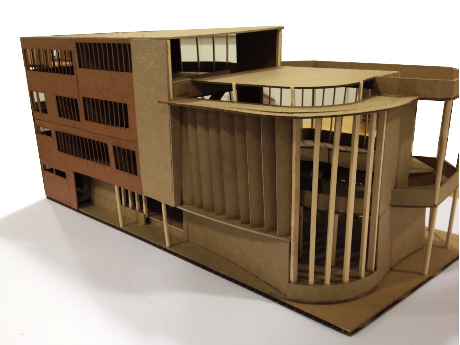 |
| Model SW Side |
The Review
The review went well for the most part. I was more adamant about my design than the previous semester, when I felt a little taken aback by how people moved in the space. This time, knowing that the people had designated areas and they can perform certain activities in each space convinced me that the location of each space was sufficient. However, having large openings could become a problem did come up. But overall, I was content with the review.
No comments:
Post a Comment